2018, the year fashion changed its name

From Grupo Cortefiel to Tendam, from Tavlex to Evlox, from Dogi to Nextil or from Michael Kors to Capri. Similarly to Kering, whose original name was PPR, or Amazon, which in the beginning started to go by the name cadabra.com, some other companies from the fashion sector have changed their name during 2018 all around the world. A need to renovate its visual identity, modernisation, simplification or accessibility are some of the reasons why fashion companies have carried out this measure.
One of the most meaningful changes was that of the Spanish company Grupo Cortefiel, which last April modified its denomination and visual image in order to become Tendam. This measure was taken under the framework of a strategic plan started in 2016. The group explained that the change of name came after a turning point in which, with so much growth and diversity, it made no sense to be called as just one of its directly-operated brands even if it is the one that marked the company’s origin.
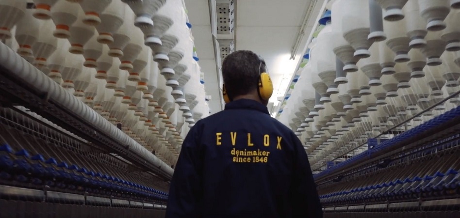
Tavex, the Spanish denim historic with more than 170 years of experience on its back, has also changed its outlook in April and earned a new name, Evlox. The main reason why, as explained by the company, was to avoid confusions with other groups who still use the same brand three years after the business was separated.

Last summer, one more Spanish group changed its nomenclature. Dogi, the historic textile company (controlled by the Sherpa Capital fund since 2014), changed the company’s corporate name to Nueva Expresión Textil (Nextil). In that way, Sherpa settled the grounds for a new period under the umbrella of the new commercial brand which now gathers five different companies.
Although their name is still the same, several Spanish companies from the sector turned its image upside down. Mayoral took a step forward in that direction in 2018: it changed its brand’s image. The children’s fashion company updated its logo to implement a new visual identity. The new logo maintains the brand’s classic blue colour, but is joined by a cloud over the letter o which appears in all of the firm’s clothing items and which substitutes the traditional letter m. The company highlighted that the new image showcases everything that the group has managed to obtain until today and provides it with certain experience so as to keep on growing.
Internationally, several companies had also undergone a change of name during the last fiscal year. The predecessor of a whole wave of new names in 2018 was personified by Coach, which last October changed into Tapestry after the acquisition of Kate Spade. Another international group who has followed this same line in 2018 was Michael Kors. In September, the company shaped its brands holding after being named as Capri right after the acquisition of Versace. The United States holding is, furthermore, owner of the luxury footwear firm Jimmy Choo as well as of Michael Kors since last year.
Under a creative direction
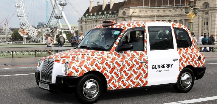
On the other hand, the British Burberry had also changed its skin due to a new logo that replaced its iconic one. The company showed off its new emblem in 2018, and it turned its image upside down. This change of outlook was also accompanied by the appointment of Ricardo Tsici as the company’s new chief creative officer. In that way, the designer has granted the company with the monogram trend that other luxury companies like Dior, Gucci or Fendi have also adopted.
Burberry’s new logo abandoned the traditional horse in exchange for a new design that combines the letters T and B in white, orange and beige, the most representative colours of the company. Under the new era slogan, Tisci presented the new logo referencing the new modernisation path that he is making the company go through.
Celine was another of the companies that renewed its image this year. The French group made this decision coinciding, too, with the arrival of a new creative director, in this case Heidi Slimane. The company’s new image, which has changed of typography and has erased the accent, is inspired in the original version of the firm’s logo in the sixties as well as in its history.

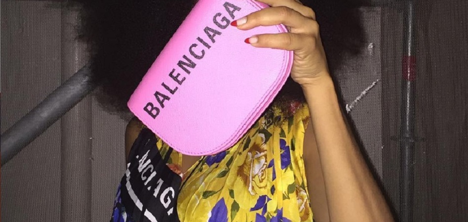
These few examples are some of the ones that joined the wave of new names or corporative images right after the appointment of a new creative director. Balenciaga, in 2018, in collaboration with Demna Gvasalia, had also changed its logo. The proposal updated the company’s image with a tighter, more vertical and condensed typography. Berluti and Balmain have been two of the brands that opted to renovate during the last fiscal year.
The former, hand in hand with its new chief creative officer Kris Van Assche, has turned the brand upside down with the redesigning of its logo adapting it to new times with a more minimalist version, changing all letters to caps and erasing the corners so as to indicate new beginnings, as stated by the company.
Balmain, for its part, has been one of the last fashion companies to turn its image around, and the group has changed its logo for the first time in seventy years. With Oliver Rousteing leading design, the French ensign is following Celine, Balenciaga or Burberry’s trend of transforming its image after the arrival of a new chief creative officer.
In this case, the change of logo came next to a strengthening strategy for the company’s accessories and complements line. In that sense, the company’s logo is much more minimalist, neat, and it is adjusted to the current needs of the brand.
The changes of names came too to the world of fairs. Regarding international ones, Mode City was named as Unique by Mode City in March, whereas in Spain, the Moman Metrópolis show shortened its name and came to be called Momad, and Momad Shoes was baptised, for the second time, as ShoesRoom by Momad.


info@themds.com
Validation policy for comments:
MDS does not perform prior verification for the publication of comments. However, to prevent anonymous comments from affecting the rights of third parties without the ability to reply, all comments require a valid email address, which won’t be visible or shared.
Enter your name and email address to be able to comment on this news: once you click on the link you will find within your verification email, your comment will be published.